Reading Time:
6 min
Learn how color grading transforms brand videos into cinematic experiences through strategic color palettes, HDR workflows, and professional post-production techniques.
Learn how color grading transforms brand videos into cinematic experiences through strategic color palettes, HDR workflows, and professional post-production techniques.

Two brands. Comparable cameras. Comparable locations. Comparable budgets for the shoot itself. Yet one video looks like it belongs in a cinema and the other looks like it was shot for a corporate intranet in 2014. The difference, almost always, is color grading.
Color grading is the post-production process of adjusting and enhancing the color, contrast, saturation, and tone of video footage. Done well, it is invisible: it elevates the material without calling attention to itself. Done poorly, it either leaves footage flat and unmotivated, or it overcorrects into something garish and inconsistent. Done with craft and strategic intent, it transforms adequate footage into something that carries genuine production value.
For B2B brands, where video increasingly carries the weight of brand reputation in enterprise sales cycles, understanding what separates a professional grade from an amateur one is not a creative nicety. It is a competitive necessity. This piece breaks down the core principles behind video post production services that deliver a cinematic look, and why they matter for brands operating at the enterprise level.
Color is not decoration. It is communication. Before a viewer processes a single word of your script, their nervous system has already registered the emotional register of your color palette. This is not a subjective claim; it is grounded in decades of perceptual psychology research.
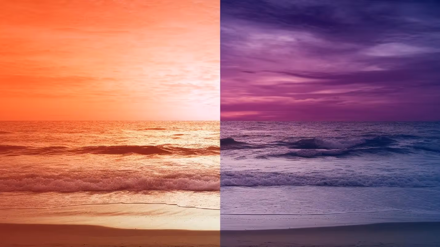
Cool tones, including blues, teals, and desaturated silvers, are the dominant color language of enterprise technology, financial services, and healthcare. They signal analytical precision, emotional restraint, and institutional scale. When IBM, Salesforce, or SAP appear in video content, the grading almost invariably leans cool.
The perceptual reason is straightforward: cool colors recede visually. They create space and distance, which the viewer unconsciously interprets as objectivity. For a brand asking a CTO to trust them with infrastructure decisions, that emotional register is exactly right.
Warm tones, including ambers, golds, and rich mid-tones with elevated red channels, communicate energy, approachability, and momentum. They are the dominant language of professional services firms that want to position themselves as human and collaborative rather than purely technical. Consulting brands, creative agencies, and companies in transformation-focused verticals tend to grade warm.
The practical risk with warm grading is skin tone management. Push amber too hard and subjects look jaundiced or sunburned. Professional video post production handles this with selective hue rotation in skin tone ranges, preserving the warmth of the environment while keeping human subjects accurate and flattering.
The most sophisticated approach used in high-end brand films is split grading: cool shadows paired with warm highlights, or vice versa. This creates visual depth and complexity that the eye reads as cinematic even without consciously understanding why. It is a technique borrowed from film colourists working on feature productions, and it is now standard in premium B2B video post production.
The display landscape has shifted significantly over the past three years. By 2026, the majority of laptop screens, professional monitors, and high-end smartphones support some form of HDR (High Dynamic Range). This is not a concern exclusive to streaming platforms; it directly affects how B2B video content renders in sales presentations, conference rooms, and executive briefings.
Standard dynamic range (SDR) video is graded to a peak brightness of 100 nits. HDR content can target 400, 1000, or even 4000 nits depending on the display standard (HDR10, Dolby Vision, HLG). The practical implication is that a grade mastered purely for SDR will look washed out and low-contrast on an HDR-capable screen, because the display is applying its own tone mapping to content that was not designed for it.
Professional video post production services in 2026 now routinely deliver dual masters: one SDR grade for web, social, and legacy display environments, and one HDR grade for premium distribution, large-format conference displays, and Apple's ProRes ecosystem.
● Shoot in a log or RAW format that preserves maximum dynamic range from the camera. S-Log3 (Sony), Log-C (ARRI), and BRAW (Blackmagic) are the professional standards.
● Grade in a colour-managed environment calibrated to the target standard. Consumer-grade monitors cannot accurately display HDR grades.
● Never deliver HDR content without a validated SDR conversion. Ungoverned tone mapping by the playback device produces unpredictable results.
● Test on multiple screens before final delivery, including the specific displays that will be used in client presentations or events.
One of the most common and under-discussed challenges in enterprise B2B video is footage consistency. A global campaign might involve shoot teams in Mumbai, Warsaw, and Toronto, working with different cameras, in different lighting environments, on different days. The raw footage from each location will look visually distinct. The finished content must look like it came from the same world.
This is where professional video post production services earn their fee, and where the difference between a technically skilled colourist and an average one becomes clearly visible.
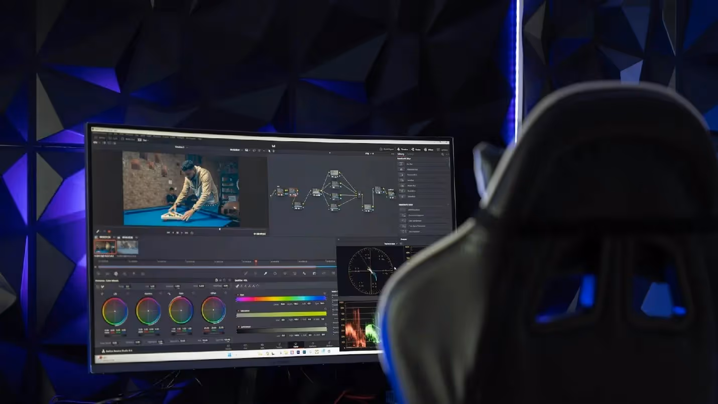
Camera matching begins before the shoot, not after it. The post production brief should specify the camera system and log profile for each production, along with a reference LUT (Look-Up Table) that gives each unit a shared starting point. The colourist can then match footage in DaVinci Resolve before the creative grade begins.
Post-shoot, the matching process involves aligning white balance, exposure, and contrast across all footage before any creative decisions are made. Only once the footage is colour-neutral and technically consistent does the creative grade begin.
Increasingly, post production teams develop brand-specific LUTs for enterprise clients with ongoing video needs. A brand LUT encodes the core color decisions: the warmth or coolness of the look, the contrast curve, the saturation range, and the treatment of highlights and shadows, into a single file that any colourist can apply as a starting point.
This does not replace creative judgment. It accelerates it. And it ensures that whether a video is produced in Q1 or Q4, by the core team or a regional production partner, it lands within the brand's visual range.
Color grading is the final creative act in video production, and in many ways the most consequential one. It is where raw footage becomes brand expression. It is where a technically competent shoot becomes a visually authoritative piece of content. And it is where brands either consolidate the investment they have made in production or quietly undermine it.
The brands that understand this invest in video post production services that treat color as a strategic discipline, not a technical checkbox. They brief their colourists with the same care they brief their creative directors. They test their grades on real displays in real environments. And they build the systems, including brand LUTs, HDR masters, and camera specs, that allow them to scale without sacrificing consistency.
Whether you are producing a single brand film or a global multi-location campaign, color grading deserves to be scoped, budgeted, and briefed as a first-class discipline, not an afterthought.
We craft videos and visuals that connect, inspire, and resonate.
Let’s create something worth watching — and remembering.