Amplified
Making public sector data impossible to scroll past. Turning the eGovernment Benchmark 2024 into a LinkedIn series that reached over 640,000 people without losing a single insight.

The Brief
Dense institutional data rarely gets the visual treatment it deserves. The challenge here wasn't understanding the findings, it was designing a visual language capable of carrying their weight without burying them. We needed a system that could arrest a scrolling thumb in under two seconds, then hold attention long enough for the numbers to land.
The design problem was precise: translate statistical rigour into motion that feels immediate, credible, and worth stopping for, across three films, on a platform built for distraction.
The Creative Process
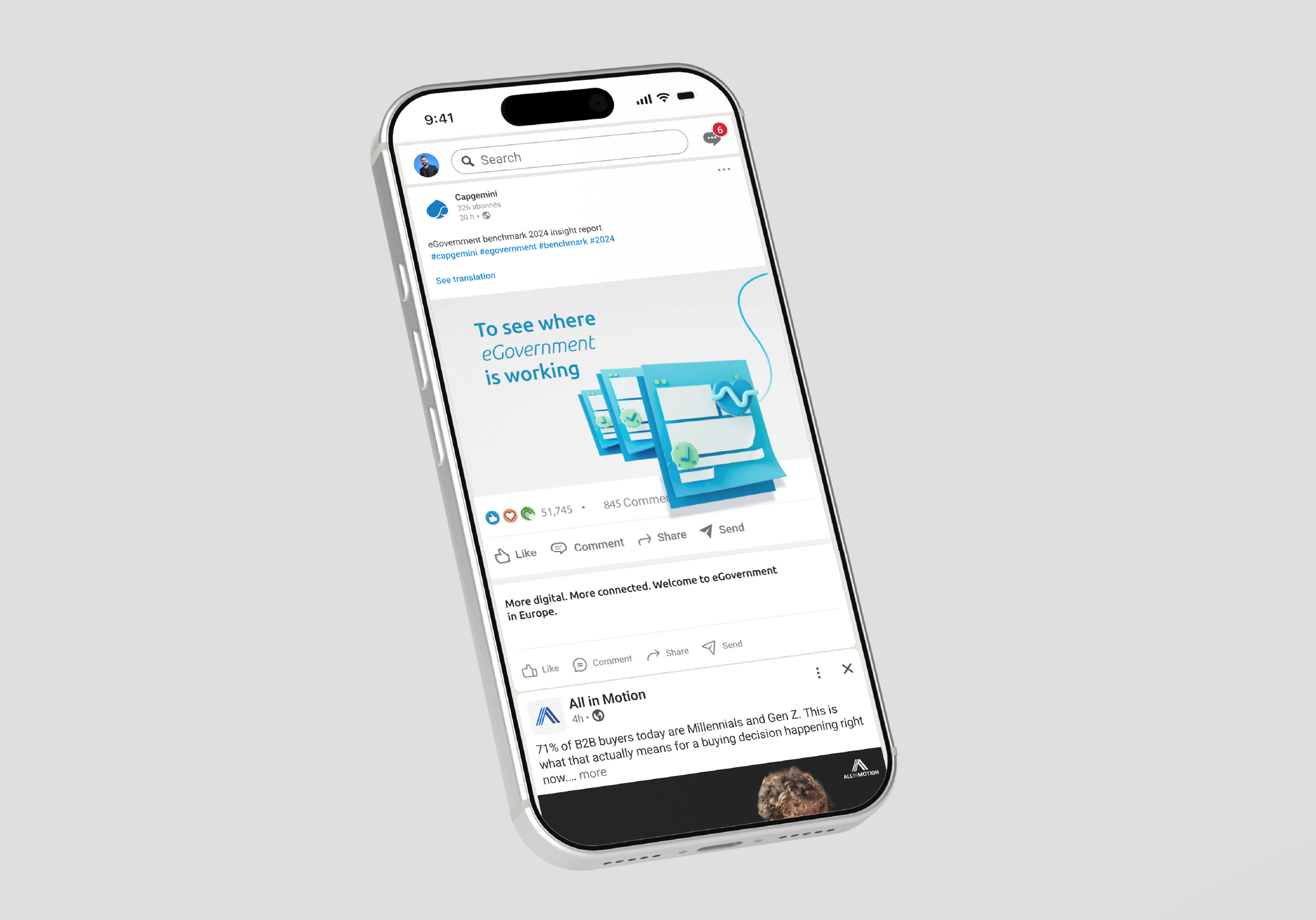
We anchored the entire series in a 3D world built from symbolic objects, classical governance pillars, AI chat bubbles, Euro coins, each chosen not for aesthetics, but for their ability to collapse complex institutional concepts into a single recognisable image. The goal was iconography that worked faster than language.
The motion language was deliberately restrained. Floating geometry created energy and depth without competing with the data itself. Every visual beat was choreographed to serve the narrative rhythm: hook, build, reveal, a structure that gave each film its own momentum while binding the series into a coherent whole. The 3D environment wasn't decoration. It was the argument.
.avif)