Proven
Six films. Ten seconds each. Zero room for anything but the truth.

The Brief
The creative challenge here was one of radical constraint. Ten seconds to establish a problem, name a real organisation, deliver a verified outcome, and make it felt. No animation to carry the weight, no narrative arc to build through. Just typography, footage, and the discipline to know what to leave out.
The design had to work as hard as the data inside it.
The Creative Process
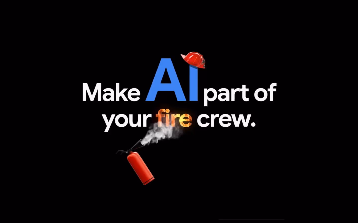
The entire visual argument rests on the relationship between two elements: words and reality. Visceral, grounded imagery places each film inside a recognisable human world, the urgency of emergency response, the weight of real operational stakes. Typography then cuts through it, precise, weighted, unhesitating, delivering the proof point with the confidence of fact rather than the warmth of storytelling.
Driving it all is a sound design and musical score built for immediate attention, the kind that makes a scrolling thumb stop before the brain has decided to. When music, image, and type are locked together and timed correctly, neither illustrates the other. They arrive as one, and the impact is inevitable.